Red Flags on a Screen: A Painter's Guide to Color-True Phone Photos
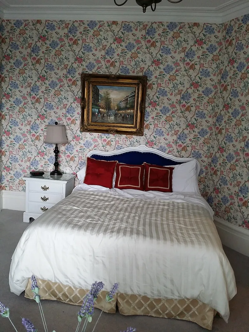
Photo: shankar s. from Dubai, united arab emirates, CC BY 2.0, via Wikimedia Commons
Your phone camera is a tiny, opinionated editor. It wants pleasant skin tones, punchy sunsets, and a balanced exposure. It does not care that your cadmium red has a specific temperature, that your grays are doing a delicate job, or that the buyer is about to spend real money on a screen that has never been calibrated in its life.
This is the gap artists fight every day: the painting on the wall versus the same painting on a buyer's phone. And the phrase 'it looks better in person' is not a compliment anymore. It is a sales problem. It tells the collector that the image they are looking at is not trustworthy, and trust is most of the transaction.
The good news is that you do not need a studio full of gear. You need a repeatable workflow, a gray card, and the discipline to stop letting auto mode make aesthetic decisions for you.
Why Your Reds Go Rogue
Phones guess. Auto white balance tries to neutralize what it thinks is a color cast, but when a painting fills the frame with warm reds, the camera may decide the whole scene is too warm and cool it down. Auto HDR blends exposures and can flatten contrast. JPEG compression smears fine detail. And then the buyer views it on a phone set to vivid mode, with night shift on, at 40 percent brightness, next to a lamp with a warm bulb.
Color management is the grown-up term for keeping all of that from ruining the evidence. You are not trying to make the photo look 'better' than the painting. You are trying to make it accurate enough that the painting's own decisions survive the trip.
A Repeatable Shooting Workflow
1. Make the wall boring
Clamp a neutral gray or white backdrop behind the work. Remove clutter, glare, and any colored object that will bounce light onto the surface. Clean the lens. Use a tripod or prop the phone on something stable. Square up the camera to the painting so the edges are parallel; do not shoot from an angle and fix it later.
2. Light it once, and only once
Mixed lighting is the enemy. A north-facing window plus a large white foam board as a fill is cheap and beautiful. If you need artificial light, use two clamp lights with matching 5000K bulbs, diffusion material, and stands. Put the lights at roughly 45 degrees to the surface. Turn off overheads and desk lamps that add a different color temperature. You want one lighting story, not three.
3. Lock the camera down
Use your phone's pro or manual mode if it has one. Lock focus and exposure by tapping and holding on the painting. Set white balance manually to match your lights — 5000K is a reasonable starting point for neutral studio LEDs. Turn off auto HDR if you can, or at least review it critically. Use the lowest ISO you can get away with. Do not digitally zoom; move the phone. Use a two-second timer so you are not shaking the camera.
4. Shoot the gray card first
Put a neutral gray card in the frame, fill the frame with it, and take one reference shot under the exact lighting you will use for the painting. Then remove it and shoot the work. This gives you a known neutral in the file. If you do not have a gray card, a clean white foam board is better than nothing, but a proper card is cheaper than a bad refund.
5. Bracket and inspect
Take three exposures: one as metered, one slightly darker, one slightly lighter. On a computer — not the phone — check the histogram and look for clipped highlights in the glazing or blown-out whites. Shoot detail crops of texture, edges, and signature. Those crops do more for online trust than a single hero image.
The Corrections That Matter
Edit with restraint. Use the gray-card frame to set white balance with an eyedropper, then apply that setting to the painting shots. Adjust exposure and contrast. Leave saturation alone unless you have a specific reason. If reds are clipping, pull saturation down slightly and check hue; do not just crank vibrance until the painting looks like a candy wrapper.
Export in sRGB. Resize for the web — around 2000 pixels on the long edge is plenty for most gallery pages — and sharpen modestly after resizing. Over-sharpening creates halos around brushstrokes and makes texture look crunchy. Calibrate your monitor if you are making color decisions for a living, or at least compare your edit on two screens.
A note in the listing that 'colors may vary by monitor' is honest, but it is not a substitute for a good file. The goal is not perfection. The goal is a photograph that a collector can believe.
The Sales Side of Color Accuracy
Show scale. Put a familiar object in a secondary image, or include dimensions in the caption. Show the edge of the canvas, the back of the stretcher, the hanging hardware. Shoot a short video under the same lighting so the buyer can see how the surface shifts as the phone moves. Consistency is the message: this is what the work looks like, and I am not hiding the finish.
When someone says 'it looks better in person,' treat it as a clue that your online presentation is underselling the work. Fix the light, lock the white balance, shoot the gray card, and edit like a coward. Your reds will stop lying, and your buyers will have one less reason to hesitate.