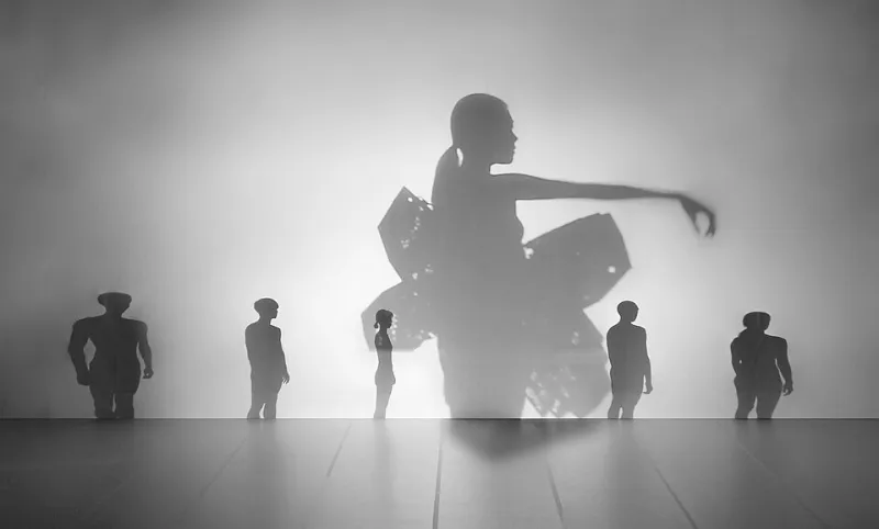
The Art of Leaving Room: Why the Best Designers Are Saying More by Showing Less
Photo: Federal Bureau of Investigation, Public domain, via Wikimedia Commons
Scroll through your Instagram feed on any given Tuesday and you'll notice something interesting. The posts that actually make you stop — the ones that earn a double-tap before your brain even registers why — often have one thing in common. They breathe. There's air in them. Space that isn't trying to sell you anything or shout for your attention. That quiet, that deliberate emptiness, has a name. And right now, it's one of the most powerful tools in a contemporary designer's kit.
Negative space — the area around and between the subjects of an image — has been part of design vocabulary forever. But what's happening in studios, galleries, and creative agencies across the country right now feels different. It's not minimalism for minimalism's sake. It's something more intentional, more aggressive even. Designers aren't just leaving space — they're weaponizing it.
From Background Filler to Foreground Statement
For a long time, negative space was treated like the shy kid at the party. It was there, but nobody really talked about it. The focus was always on the thing — the product, the subject, the message. White space was what happened when you ran out of stuff to put on the page.
That thinking has flipped completely.
Contemporary designers, especially those working in brand identity and editorial, are now building compositions where the empty area is the first thing your eye reads. Think about the FedEx logo — that hidden arrow between the E and the x has been doing silent storytelling work for decades. Or consider how Apple's product photography leans so hard into white space that the emptiness itself communicates luxury and precision before you've even registered what product you're looking at.
The shift is philosophical as much as it's aesthetic. When the visual landscape is this saturated — every surface competing, every pixel monetized — restraint becomes radical. Choosing not to fill space is a statement about confidence. It says: what's here is enough. You don't need to look anywhere else.
Fashion's Love Affair With the Void
Few industries have embraced strategic emptiness as enthusiastically as fashion. Walk through any high-end boutique in New York's SoHo or LA's Melrose area and you'll notice the merchandising philosophy immediately. Fewer pieces. More floor. Longer pauses between racks.
This isn't accidental. It's a visual argument for value.
Designers like Jil Sander and Lemaire have built entire brand identities around garments that exist in a kind of visual silence — clean lines, minimal print, colors that don't compete with each other. But the negative space philosophy extends beyond the clothes themselves into how those clothes are presented. Campaign imagery for these brands often features a single figure against a flat, expansive backdrop. The emptiness around the subject elevates it. You're not distracted. You're forced to really look.
Streetwear brands have caught on too, just in their own way. Limited drops presented on near-blank product pages. Lookbooks with massive margins. The message is the same whether it's a $40 hoodie or a $400 coat: we're confident enough in what we made to let it stand alone.
Web Design and the Courage to Leave the Grid Empty
Digital design is where the negative space conversation gets really interesting — and honestly, a little contentious. The pressure to fill every pixel of a webpage with something useful, something clickable, something that converts, is enormous. Marketing teams want more CTAs. Product managers want more features surfaced. The result is often a cluttered mess that exhausts users before they've found what they came for.
But a wave of designers is pushing back.
Sites built around generous white space — think portfolio sites, independent publications, and direct-to-consumer brands in the wellness and beauty space — are consistently outperforming their busier counterparts in time-on-page and return visits. It turns out that when you give someone's eye a place to rest, they actually stick around longer.
The trick is understanding that negative space in web design isn't dead air. It's pacing. It's the visual equivalent of a well-timed pause in a conversation. It tells the reader: slow down, this part matters. Used well, it creates hierarchy without hierarchy markers — no bold text or arrows needed. The space itself points to what's important.
Gallery Installations: Where Emptiness Becomes the Medium
If you really want to see negative space taken to its logical extreme, spend time in contemporary gallery installations. Artists working in this space have moved so far beyond the canvas that the room itself — its silence, its volume, its air — becomes part of the work.
James Turrell's light installations are a good entry point here. His pieces at the Guggenheim and various museums across the US use architectural space so deliberately that visitors often describe feeling like they're inside a thought. There's almost nothing there in the traditional sense. And yet the experience is overwhelming.
Smaller-scale installation artists are doing similar work — building environments where what isn't present shapes how you experience what is. A single object suspended in a large, dark room. A painting hung with five feet of bare wall on each side. The emptiness isn't background. It's load-bearing.
This approach is influencing how galleries themselves are being designed. Curators are rethinking density, giving works more room to breathe, trusting that visitors will engage more deeply with fewer pieces presented more intentionally.
Strategic Restraint as a Creative Practice
So what does it actually look like to build negative space into your creative process intentionally, rather than just stumbling into it?
The designers and artists doing this best tend to share a few habits. They finish a composition and then ask: what can I remove without losing the message? They treat empty areas as active decisions, not defaults. And they resist the cultural pressure — especially strong in American creative culture — to equate more with better.
There's a useful exercise here: take any piece you're working on, whether it's a layout, a painting, a photograph, or a brand identity, and identify the one thing it absolutely cannot live without. Then build the space around that thing. Let everything else fall away. See what's left.
More often than not, what's left is exactly enough.
In an era when attention is the scarcest resource we have, knowing how to command it through stillness rather than noise is a genuine competitive advantage. The designers and artists who've figured this out aren't doing less. They're doing something much harder — they're being precise.
And precision, it turns out, looks a lot like empty space.