Less Is More Vivid: How Contemporary Artists Are Finding Power in Palette Restraint
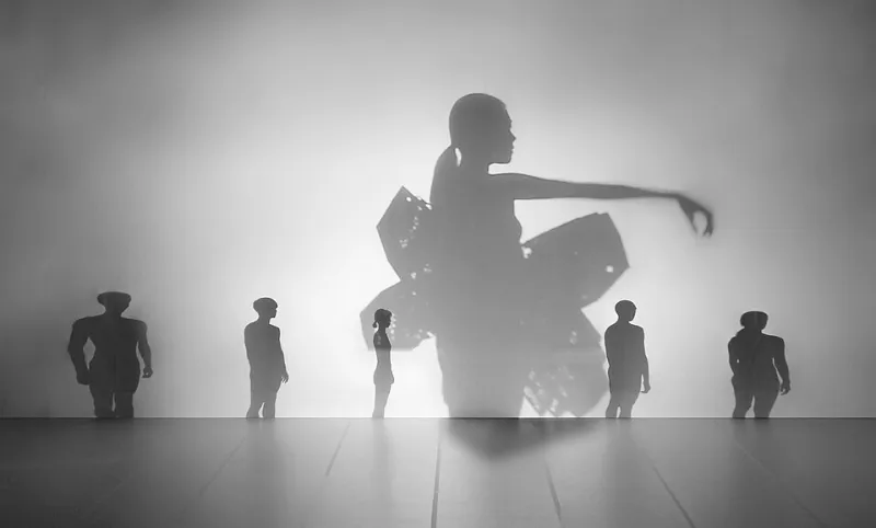
Photo: Teahankim, CC BY-SA 4.0, via Wikimedia Commons
Walk through any major contemporary art fair in the US right now — Frieze LA, the Armory Show in New York, Art Basel Miami Beach — and you'll notice something that feels almost counterintuitive. In a world drowning in visual noise, the work that stops people cold tends to be the quietest in color. Canvases washed in a single warm gray. Prints built from two or three tones at most. Ink drawings that let the white of the paper do half the talking.
This isn't an accident. It's a deliberate artistic philosophy, and it's reshaping how we think about color's role in contemporary visual storytelling.
The Overstimulation Backlash
Let's be honest about the world we're living in. Between social media feeds, streaming thumbnails, neon-drenched advertising, and the relentless churn of digital content, our eyes are exhausted. Color has become a marketing weapon — brands splash saturated hues across everything to grab attention in the scroll. And somewhere along the way, a lot of that color lost its meaning.
Contemporary artists are responding to that saturation with something radical: silence.
"When everything around you is screaming in full color, a quiet palette becomes the loudest thing in the room," explains color theorist and educator Dr. Renata Fosse, who consults with art programs across the Northeast. "There's a psychological phenomenon where restraint creates intimacy. You lean in. You slow down. The viewer actually has to participate in the work."
That participatory quality is exactly what artists like Madhur are chasing. In Madhur's recent series of mixed-media compositions, the deliberate limitation to near-neutral tones — warm ochres, deep charcoals, dusty whites — forces the eye to find depth in texture, line weight, and form rather than relying on chromatic contrast. The effect is meditative. Even a little haunting.
Color Psychology Isn't Just for Marketers
Most people encounter color psychology in the context of branding — why fast food chains love red and yellow, why banks favor blue. But the field runs much deeper than that, and contemporary artists are mining it in sophisticated ways.
Monochromatic work, for instance, tends to trigger a more sustained emotional response than polychromatic compositions. Research in visual perception suggests that when the brain isn't busy sorting through competing hues, it allocates more cognitive resources to processing mood, narrative, and spatial relationships within a piece. In short, limited color can actually create a richer emotional experience — not a poorer one.
This is something artists working in ink, graphite, and limited-dye printmaking have understood intuitively for centuries. What's new is the conscious, almost philosophical articulation of it within the contemporary art conversation. Artists today aren't just using a limited palette — they're talking about why, in interviews, artist statements, and online communities, making color restraint part of their creative identity.
What Collectors Are Noticing
The shift isn't going unnoticed by the people buying art either. Chicago-based collector Marcus Thill, who has been acquiring emerging contemporary work for about a decade, says his purchasing habits have changed noticeably in the last few years.
"I used to gravitate toward bold color because it felt energetic, alive," he says. "But I've found that the pieces I keep coming back to — the ones that still feel fresh five years later — are almost always restrained. There's something about a limited palette that ages beautifully. It doesn't date itself the way trend-driven color choices can."
That longevity factor is a real consideration for serious collectors. A painting built around a trending color moment can feel dated within a few years. Work that leans into timeless neutrals or explores a single hue in extraordinary depth tends to hold its visual relevance — and often its market value — much longer.
The Craft Argument: Harder Than It Looks
Here's something worth saying plainly: working with a limited palette is harder than reaching for the full spectrum. When you only have two or three colors to work with, every decision carries exponentially more weight. Value relationships, temperature shifts within a single hue, the texture of application — all of it becomes critical in a way that a more chromatic approach can sometimes mask.
For Madhur, this constraint is part of the appeal. The creative process becomes a kind of problem-solving exercise, finding ways to suggest warmth, distance, tension, and calm using tools that most artists would consider insufficient. It's the visual equivalent of writing a compelling short story rather than a sprawling novel — every word, every mark, has to earn its place.
Emerging artists who've adopted this approach often describe a similar experience: an initial frustration followed by a kind of creative liberation. When you remove the option of solving a compositional problem with a new color, you're forced to solve it with better drawing, better composition, better understanding of light. The limitations become a master class.
Where This Is Heading
The limited-palette movement — if we want to call it that — shows no signs of fading. If anything, as digital tools make full-color, hyper-saturated work easier to produce than ever, the handcrafted restraint of monochromatic and limited-palette work becomes more distinctive, not less.
There's also a growing conversation in art education circles about reintroducing traditional palette limitation exercises into curricula that had drifted toward digital-first, full-spectrum workflows. The argument is that understanding color deeply means understanding what it does when you take most of it away.
For artists navigating a crowded, noisy creative landscape, that understanding might be the most powerful tool in the studio. Sometimes the boldest creative choice you can make is the one that asks your audience to stop, breathe, and really look.
And in a world that rarely slows down, that's saying something.