Hang It Like You Mean It: A Room-by-Room Guide to Living With Art You Actually Love
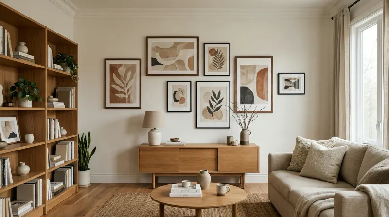
Photo: curated gallery wall of original art in stylish living room interior, via gallerywall.art
Walk into any great collection — museum, private, or your coolest friend's apartment — and you'll notice something the individual pieces can't explain on their own. The rooms feel composed. Not decorated. Composed.
That's not money. That's intention. And intention, unlike money, is available to everyone. What follows is a room-by-room framework for building a home around art you love, on a budget that starts at roughly the cost of a nice dinner out.
One rule before we start: buy what stops you. Not what matches the sofa. The sofa can catch up.
The Bedroom: Calm
The bedroom wants low visual noise and soft contrast. Think muted palettes — dusty blues, warm neutrals, sage — and compositions with generous negative space. This is the room where a single large piece outperforms a gallery wall every time. One work, hung low enough to relate to the bed rather than float above it.
Color theory, briefly: cool hues recede and slow the pulse, which is why every hotel chain on earth paints bedrooms blue-gray. Lean into it. Abstract works with soft edges and limited palettes — a lot of contemporary minimalists fit here — cost less than figurative work and do more for a sleeping brain.
Where to find it: student shows at local art schools, where original pieces routinely go for under $200.
The Living Room: Bold
The living room is your public gallery, and it can take a hit of energy. This is where saturated color earns its keep — a red-dominant piece, a dense abstract, something with actual scale. The classic mistake is going too small: a 12x16 on a wall that could hold 36x48 looks like an apology.
If you can't afford large, fake it with a salon-style cluster. Group smaller pieces in a tight grid or an organic cluster with roughly two inches between frames, and treat the whole arrangement as one artwork. Sketch the layout on the floor first. Tape it on the wall with paper templates before committing a single nail.
The Dining Room: Warm and Social
Dining rooms collect the longest dinner conversations, so the art should reward staring but never agitate. Warm tones — ochre, terracotta, deep green — read as appetite and intimacy. Figurative work, still life, and landscape all perform well here; there's a reason restaurants hang food-adjacent imagery.
Lighting is the upgrade that changes everything in this room. A picture light or a well-aimed track head turns a modest piece into a focal point after sunset. Warm bulbs (2700K) flatter art the way they flatter candlelight. Skip the direct sunlight entirely — it fades pigments faster than anything else in your house.
The Entryway: First Impression
The entryway gets three seconds of attention and sets the tone for everything after. This is the place for a statement piece with personality — something with wit, or tension, or a story you enjoy telling guests. It's also the perfect spot for the one 'weird' purchase you love but can't place anywhere else.
Hang it at eye level — the actual center of the piece at about 57 to 60 inches from the floor, the standard museums use. Most homes hang art too high. Yours doesn't have to.
The Home Office: Focus
Workspaces want art that occupies the peripheral vision without hijacking attention. Geometric abstraction, grids, and works with rhythmic repetition do something quietly useful here: they give your eyes a rest stop during long screen sessions. Blue and green tones again earn their reputation for sustained concentration.
This is also a good room for works on paper — drawings, prints, photographs — which are the most affordable entry point into original art anywhere. Archival framing matters more here than anywhere else, since paper hates light. UV-filtering glass is worth every dollar.
The Bathroom and Hallway: The Overlooked Tier
Nobody budgets art for a hallway, which is exactly why it works. A hallway is a gallery corridor by design — a sequence of pieces at walking pace. Rotate them. Bathrooms, meanwhile, are the last frontier of serious collecting: small, humid, and perfect for inexpensive framed prints or small originals in sealed frames. Guests notice bathroom art disproportionately. It's the room where they're alone with it.
The Kitchen: Nostalgia
End where the day does. Kitchens are memory rooms, and the art should be too — vintage posters, family photographs printed properly for once, a piece inherited from someone whose cooking you can still smell. Nostalgia is a legitimate collecting category, and it's the one mood money genuinely can't buy.
The Collector's Cheat Sheet
A few closing principles that apply to every room above:
- Buy originals when you can, prints when you must, and always frame well. A $150 print in a $100 frame outperforms a $400 original in a cheap one.
- Give each piece breathing room. Crowding reads as clutter; space reads as confidence.
- Mix eras and price points freely. A thrift-store find next to a piece from a young artist's Etsy shop is not a compromise — it's a collection.
The point of all this isn't to make your home look like a museum. It's the opposite: a museum puts art behind a rope. You get to live inside yours.